Color in Garden Design

Garden designers generally guide themselves using some basic principles of home interior design. Namely the principles of form, line, texture, scale and color. In an earlier post, we talked about basic color theory and how colors affect us psychologically. Understanding color and how to arrange plants based on this is essential to a well designed garden plan.

Context
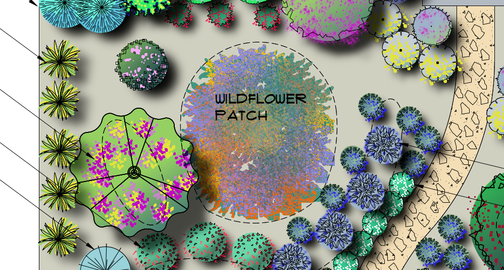
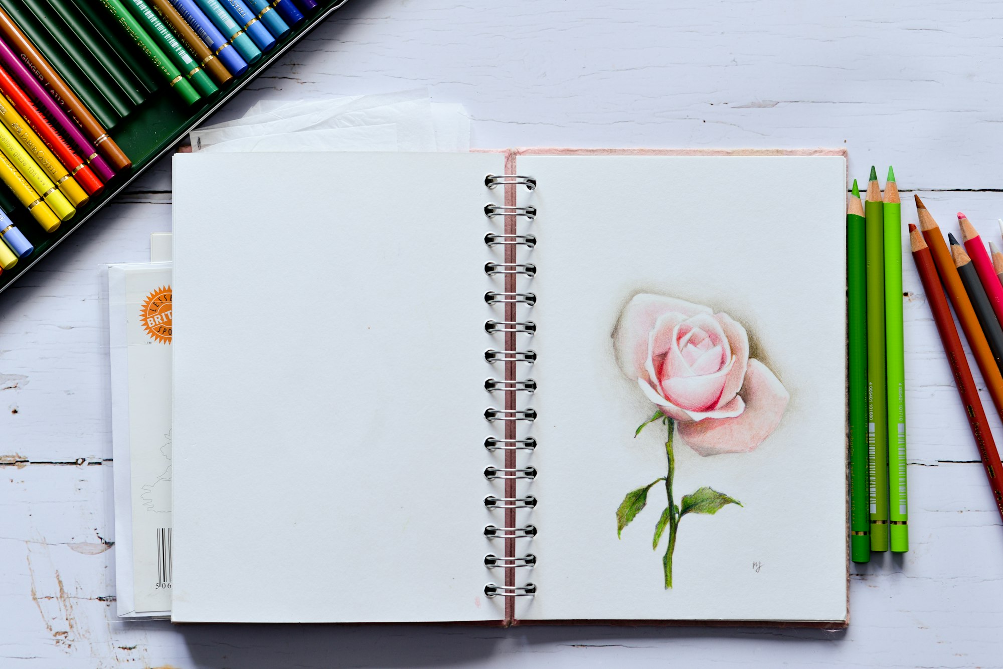
Choice of colors to be used in the garden should not be made based on an individual plant. Think about how the different plant colors affect each other and how they affect the garden visitor (and residents). Too much of any one color can make your planting look too homogeneous, and individual flair from a single plant type may be lost in the crowd. Understanding the Color Wheel can help you make the individual plants in your design compliment each other. Color Temperature of plants can be used to provide the best placement of each planting area. It helps to have some color pencils to add color to your plans and get a good idea of how your planting design ties together with the colors of plants you have selected , whether they were created by hand or digitally.

Color Wheel
Color theory in design is based on the color wheel, a diagram that shows the relationship between all the colors of the spectrum. There are three primary colors: blue, red and yellow, that can be mixed in different ways to make all other colors. Secondary colors: green, orange and violet (purple), are made by mixing two primary colors. Tertiary colors are made from mixing several secondary and/or primary colors. For example, when blue and yellow are mixed, they make green. When yellow and red are mixed, they make orange. When red and blue are mixed, they make purple. In the color wheel, the secondary and tertiary colors are located between the two primary colors that are mixed to make that color. Colors opposite each other on the color wheel (e.g. Red and Green) create the greatest contrast when placed next to each other. When 2 colors have this relationship, they are called complimentary colors.

Note that the color wheel is based on human perception of color. Wild animals do not always see the same colors we can see, so if attracting wildlife is your goal this requires a different approach than designing for people.
Color Temperature (Warm vs Cold)
Accomplished garden designers describe their plant palettes to clients in terms of warm vs cool. Red, Yellow and Orange are types of warm colors. Blue, Purple and Green are examples of cool colors. Ever notice how Red pops against a green background, that’s because the warm red is not diluted by the cool Green, and is a great way to create contrast.

Warm colors tend to appear closer to you, and this is why they are best used in large spaces to make them feel more cozy. Cool colors can make a space seem larger, and are best placed in the foreground so that the border does not overwhelm the viewer.
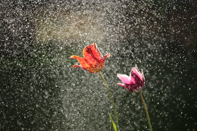
Try it for yourself, think about your plant choices based on warm and cool colors, and try to see how the warm and cool colors interact with each other. Try to think about all the colors of the plant, not just the blossoms as they are often temporary in nature.


